Thursday, November 6, 2008

Star Plots


A star plot is a graphical method of displaying multivariate data with an arbitrary number of variables. Each variable is represented by a separate spoke, with each star representing a single observation. The length of each spoke is proportional to the magnitude of the variable for the data point relative to the maximum magnitude of the variable across all data points. A line is drawn connecting the data values for each spoke. This gives the plot a star-like appearance and the origin of the name of this plot.

Star plots can be used to answer such questions as: What variables are dominant for a given observation? Which observations are most similar, i.e., are there clusters of observations?
Are there any outliers?
The star plot observed above depicts crime rates as a function of 7 separate variables of major cities across the US.
http://www.math.yorku.ca/SCS/Gallery/images/starcrim2.gif

Correlation Matrix


A correlation is a single number that describes the degree of relationship between two variables. A Correlation Matrix lists the individual correlations between any two sets of variables.

To locate the correlation for any pair of variables within the matrix, you would need to find the value in the table for the row and column intersection for those two variables. correlation Matrices are quite similar to similarity matrices, except for that correlations have values ranging ONLY from -1 to 1, with -1 representing the least amount of correlation and 1 respresenting the greatest.

Similarity Matrix

A similarity matrix is a matrix of scores which express the similarity between two data points. They are used in sequence alignment: higher scores are given to more similar characters, and lower or negative scores are given for dissimilar characters.
Above is a similarity matrix of common amino acids. The similarity or dissimilarity of each amino acid pair can be found by finding the cross value of the two.

Stem and Leaf Plot


A stem-and-leaf plot is a display, similar to a histogram, that organizes data to assist in visualizing the shape of a distribution. A basic stem and leaf plot contains two columns separated by a vertical line. The left column contains the stems (the first digit of a value) and the right column contains the leaves (the remaining digits of each value).


Box Plot

A Box Plot, also known as a box-and-whisker diagram, is an effecient method used for displayig 5-number data summaries. Box Plots summarize the following statistical measures: median, upper and lower quartiles, and the minimum and maximum data values. An example of a boxplot is shown below:

Wednesday, October 29, 2008

Histogram


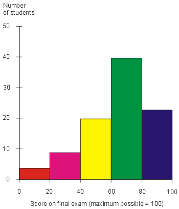
A histogram is a graphical display of frequencies, shown as bars. It shows what proportion of observations fall into each of several preset categories. A histogram differs from a bar chart in that it is the area of the bar that denotes value, not the height as in bar charts. The histogram above shows frequencies of exam scores, and the area under each segment is directly proportional to the number of scores falling into that category.
http://media.techtarget.com/digitalguide/images/Misc/iw_histogram.gif

Parallel Coordinate Graph


Parallel Coordinate graphs is a data visualization technique used in analyzing large sets of multivariate data. Each variable in the data plot is represented as its own Y Axis on the graph. A maximum point for each Y axis is selected, and they are scaled relatively to each other so that each variable takes up the same area in the graph space. Each line drawn represents a single observation as it relates to each variable. Lines are drawn across each variable for each observation.
The Parallel Coordiate graph above illustrates correlations in gene expression data for different species of drosophilia (fly genes).

Triangular Plot


A triangular plot is one in which, as its name suggests, displays three variables or data sets in the shape of a triangle.
The above triangular plot plots different soil textures on each side of the triangle and the composition of different soil types by percentages of each different texture within the triangle's center.


http://soil.scijournals.org/content/vol65/issue4/images/large/1038f2.jpeg

Windrose


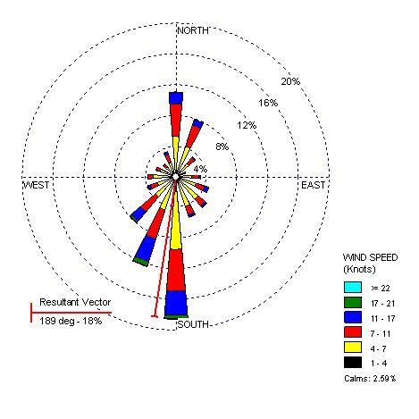
A wind rose is a graphic tool used by meteorologists to give a succinct view of how wind speed and direction are typically distributed at a particular location. Presented in a circular format, the wind rose shows the frequency of winds blowing from particular directions. The length of each "spoke" around the circle is related to the frequency that the wind blows from a particular direction per unit time. Each concentric circle represents a different frequency, emanating from zero at the center to increasing frequencies at the outer circles.
The above windrose is for Seattle, Washington.


Climograph

A climograph is a graphical depiction of the monthly precipitation and temperature conditions for a selected place. Precipitation is shown by the bar graph. A line graph depicts temperature.
Below is an example of a climograph for Memphis, Tennessee:


http://www.uwsp.edu/geo/faculty/ritter/images/atmosphere/climate/climographs/memphis.jpg

Population Profile


A population profile can be defined as a chart showing the number of people as a function of their ages for any given location. The above population profile illustrates the breakdown of population by age in the US for the years 1970, 1980 and 1990. Population profiles also for viewers to see changes in population distribution by age over time.http://www.co.nezperce.id.us/planning/comp_plan/1998_CPLAN/Fig9-3.jpg

Scatterplot


Scatter plots are similar to line graphs in that they use horizontal and vertical axes to plot data points. Scatter plots have a very specific purpose in that they show how much one variable is affected by another. The relationship between two variables is called their correlation .


Scatter plots usually consist of a large body of data. The closer the data points to making a straight line when plotted, the higher the correlation between the two variables and the stronger their relationship. Scatterplots should be constructed when the relationship between two variables is of interest.
The above scatterplot is interesting, as it plots the age of husbands versus the age of their wives. It shows that ages among husband and wife have a high correlation (people tend to marry others around their same age).


Index Value Plot


An index is defined as a statistical indicator/number derived from a formula, which is used to characterize a set of data.

An index value plot is a type of visualization map that is plotted on a line graph.

Accumulation Line Graph or Lorenz Curve


The Lorenz curve is used in economics and ecology to describe inequality in wealth or size. It is a graphical representation of the proportionality of a distribution (the cumulative percentage of the values).
A graph for showing the concentration of ownership of economic quantities such as wealth and income, it is formed by plotting the cumulative distribution of the amount of the variable concerned against the cumulative frequency distribution of the individuals possessing the amount.
The Lorenz curve above illustrates a representation of the cumulative distribution of income by population.
http://content.answers.com/main/content/img/oxford/Oxford_Geography/0198606737.lorenz-curve.1.jpg

Bilateral Graph

Bilateral graphs depict increases and decreases on either side of a zero line. They are used to display data of both positive and negative values. An example of a bilateral graph is shown below:


This bilateral graph is a depiction of fertility changes in Chile over the past 25 years. You can see from the graph that for most of the past 25 years there has been a decrease in fertility among Chileans, with the exception of a short period of increase in the late 80's early 90's.
http://clausvistesen.squarespace.com/storage/thumbnails/325258-1851195-thumbnail.jpg

Friday, October 17, 2008

Google Earth - Remote Sensing


The above image is a remote sensing image taken from MODIS active fire mapping program. The website for this is http://activefiremaps.fs.edu.us. It shows the number of active fires reported in the contintental US within the last 24 hours and is updated hourly.

Monday, October 13, 2008

Nominal area Choropleth Map


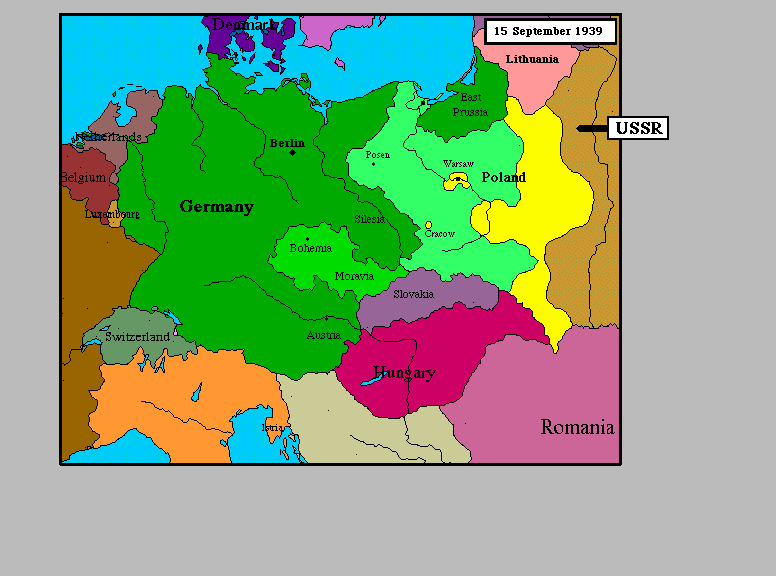
Nominal Area Choropleth maps are used to display nominal data over a specified region. Nominal data is defined as categorical data where the order of the categories is arbitrary, such as race, ethnicity, political party, hair color, etc...
Above we see nominal data (European nations) mapped to colors. Notice that the colors aren't in an organized scale in any sense. There are no obvious color ramps to imply order. We simply map nomimal values onto discrete colors.


Unstandardized choropleth Maps


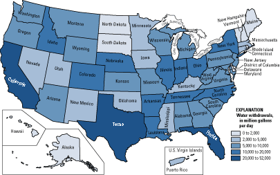
Unstandardized Choropleth Maps utilize data sets of raw numbers. The data displayed is not averaged but is represented as a total value.The above unstandardized Choropleth map dispays the number of water withdrawals by state across the US.
http://pubs.usgs.gov/fs/2005/3051/images/2000choropleth.gif

Standardized Choropleth maps


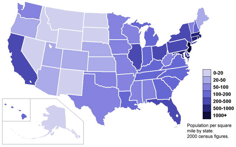
The data/information portrayed in standardized choropleth maps is "standardized" or "normalized", which allows for comparison of distribution among different areas.

The standardized choropleth map shows population density according to the states' areas in square miles.

Univariate Choropleth Maps


Univariate Choropleth maps use basic choropleth mapping techniques to illustrate the distribution of one single variable through shades of color or patterns. The above map shows the distribution of average/median household income for states across the US. Each range of income is represented by a different color, and each state is colored according to where they fall in these ranges.