Wednesday, October 29, 2008

Triangular Plot


A triangular plot is one in which, as its name suggests, displays three variables or data sets in the shape of a triangle.
The above triangular plot plots different soil textures on each side of the triangle and the composition of different soil types by percentages of each different texture within the triangle's center.


http://soil.scijournals.org/content/vol65/issue4/images/large/1038f2.jpeg

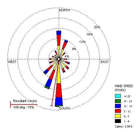
Windrose


A wind rose is a graphic tool used by meteorologists to give a succinct view of how wind speed and direction are typically distributed at a particular location. Presented in a circular format, the wind rose shows the frequency of winds blowing from particular directions. The length of each "spoke" around the circle is related to the frequency that the wind blows from a particular direction per unit time. Each concentric circle represents a different frequency, emanating from zero at the center to increasing frequencies at the outer circles.
The above windrose is for Seattle, Washington.


Climograph

A climograph is a graphical depiction of the monthly precipitation and temperature conditions for a selected place. Precipitation is shown by the bar graph. A line graph depicts temperature.
Below is an example of a climograph for Memphis, Tennessee:


http://www.uwsp.edu/geo/faculty/ritter/images/atmosphere/climate/climographs/memphis.jpg

Population Profile


A population profile can be defined as a chart showing the number of people as a function of their ages for any given location. The above population profile illustrates the breakdown of population by age in the US for the years 1970, 1980 and 1990. Population profiles also for viewers to see changes in population distribution by age over time.http://www.co.nezperce.id.us/planning/comp_plan/1998_CPLAN/Fig9-3.jpg

Scatterplot


Scatter plots are similar to line graphs in that they use horizontal and vertical axes to plot data points. Scatter plots have a very specific purpose in that they show how much one variable is affected by another. The relationship between two variables is called their correlation .


Scatter plots usually consist of a large body of data. The closer the data points to making a straight line when plotted, the higher the correlation between the two variables and the stronger their relationship. Scatterplots should be constructed when the relationship between two variables is of interest.
The above scatterplot is interesting, as it plots the age of husbands versus the age of their wives. It shows that ages among husband and wife have a high correlation (people tend to marry others around their same age).


Index Value Plot


An index is defined as a statistical indicator/number derived from a formula, which is used to characterize a set of data.

An index value plot is a type of visualization map that is plotted on a line graph.

Accumulation Line Graph or Lorenz Curve


The Lorenz curve is used in economics and ecology to describe inequality in wealth or size. It is a graphical representation of the proportionality of a distribution (the cumulative percentage of the values).
A graph for showing the concentration of ownership of economic quantities such as wealth and income, it is formed by plotting the cumulative distribution of the amount of the variable concerned against the cumulative frequency distribution of the individuals possessing the amount.
The Lorenz curve above illustrates a representation of the cumulative distribution of income by population.
http://content.answers.com/main/content/img/oxford/Oxford_Geography/0198606737.lorenz-curve.1.jpg