Tuesday, September 23, 2008

DLG


Above you will see an example of a USGS hydrographic DLG of the Tsala Apopka Basin located in Citrus County, Florida.
DLG stands for Digital Line Graph. DLGs contain a wide variety of information, including but not limited to: topography, hydrography, boundaries, roads, utility lines, and vegetative surface cover. Digital Line Graphs (DLGs) are digital vector representations of cartographic information derived from USGS maps and related sources. Data about map features are stored as lines (arcs), points, and polygons (areas).

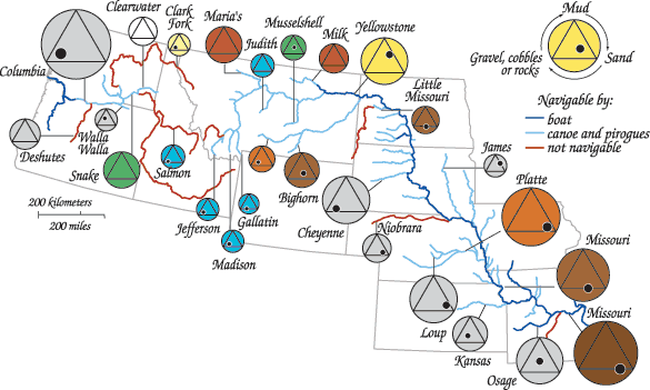
Continuously Variable Proportional Circle Map


A proportional circle map is one in which point data is mapped with a circle instead of a dot. The size of the circle is directly related to the measured variable and NOT necessarily to the area over which it is measured. Specifically, with regards to a Continuously Variable Proportional Circle Map, the size of the circle used corresponds to a specific level of the measured variable in questions. There is no limit on the number or sizes of circles used because they are continuously graded along with the variable. So, as the size of the measured variable increases, the size of the circle will increase in direct proportion to the variable.
the continuously proportional circle map above is illustrating channel width through the use of proportional circles. The size of the circle is directly proportional to the width of the channel.

DOQQ


A Digital Orthographic Quarter-Quad, DOQQ, is a digitized image of an aerial photograph, corrected for displacements caused by camera angle and relief. The result is a spatially accurate image with planimetric features appearing in their true geographic positions. Distortion corrections are made through georectification (features on the map are linked to their real world positons through a coordianate system, datum, and projection) and orthrectification (distortion is removed so that the photo can be used as a flat map; ground features are displayed in their true positions, allowing for more accurate measurement of distance, areas, angles, and positions). Orthophotos combine the image characteristics of a photograph with the geometric qualities of a map.
The above DOQQ is of Brandywine, British Columbia.
http://www.wr.udel.edu/cb/b17doqqqpuzzle.jpg

DEM


DEM, Digital Elevation Model, is a digital file consisting of terrain elevations for ground positions at regularly spaced horizontal intervals. It is in raster format, so the cartographic dats is recorded, stored and processed in a cell or pixel. DEM's are georeferenced, meaning their features are tied into a coordinate system, datum, and map projection and reference specific locations (i.e. latitude & longitude) in space.

DEMs are commonly built using remote sensing techniques, however, they may also be built from land surveying. DEMs are used often in GIS, geographic information systems, and are the most common basis for digitally-produced relief maps.
Above you will see a DEM for Honolulu, HI. Note the use of shading to illustrate increasing elevation. The lowest level of elevation starts out with the dark shades of green, gradually lightening through shades of yellow, brown and white to represent those areas of higher elevation.

DRG


A DRG, digital raster graphic, is a scanned and georectified image of the paper version of the U.S. Geological Survey topographic maps. These provide a way to view the US Geological surveys in digital format. Most DRG's are made by scanning published paper maps on high resolution scanners, such as is shown on the DRG above.

Isopleths

An isopleth is also known as a contour line. It is a feature of some charts and maps, connecting points which have an equal value of some variable at a given time and spatial area. The particular variables shown may include values such as pressure, temperature, wind speed, population, etc. They are used to assist in visualizing the general features of an area. Some common types of isopleths include: isotherms (points of equal temperature); isobars (points of equal pressure); isohyets (points of equal precipitation). Below, you will see an illustration of the construction of an isopleth map, beginning with various values and ending with lines and shadings connecting those points of equal value.

http://www.fao.org/DOCREP/003/T0446E/T044648.gif

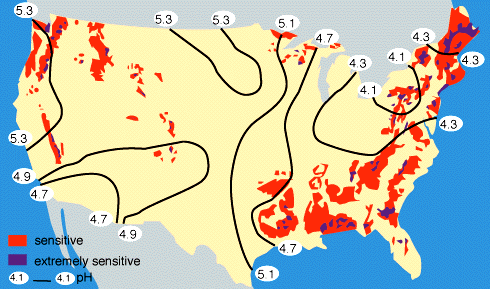
Isoplaths

An isoplath map is a type of contour line map that uses lines to connect areas of equal acidity's. These contour lines are known as isoplaths, hence the term "isoplath map." An example of an isoplath map is shown below:

http://www.globalchange.umich.edu/globalchange1/current/lectures/kling/water_nitro/USAacid_rain2.gif

Isohyets

An isohyet or isohyetal line is a line joining points of equal precipitation on a map. A map with isohyets is called an isohyetal map. Below is an example of an isohyetal map of Hong Kong:


http://www.hko.gov.hk/publica/tc/tc2002/images/figure/figure332.gif

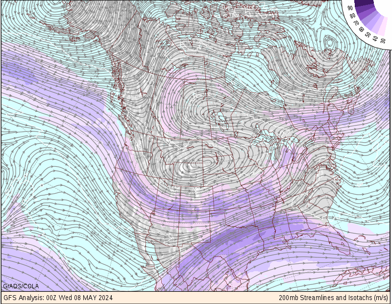
Isotachs

Isotachs are contour lines on a map indicating equal wind speeds. So, all points along an isotach would have equal wind speeds. Below is a map with isotach contour lines of wind speeds across north america.

Isobars

A line drawn on a weather map connecting points of equal pressure is called an isobar. That means, that at every point along a given isobar, the values of pressure are the same. The isobars are generated from mean sea level pressure reports and the pressure values are given in millibars.

The above is a map of isobars indicating areas of equal pressure across parts of Europe.
http://www.windfinder.com/grafiken/isobars/isobars_central_europe_1.gif

Wednesday, September 17, 2008

LIDAR

LIDAR stands for "Light Detection And Ranging". With LIDAR you can: measure distance; measure speed; measure rotation; and measure chemical composition and concentration. Light Detection and Ranging (LIDAR) is a remote sensing system used to collect topographic data.

This technology is used by the National Oceanic and Atmospheric Administration (NOAA) and NASA scientists to document topographic changes along shorelines, as illustrated in the LIDAR image below of Hilton Head, South Carolina:

In remote sensing, false color images are common. They serve as a means for visualizing data. The term "false color" refers to the fact that these images are not photographs. Rather, they are digital images in which each image pixel represents a data point that is colored according to its value. So, in LIDAR elevation maps, each pixel represents a certain elevation and is colored on the map accordingly to the color that corresponds to that particular elevation.
http://www.csc.noaa.gov/products/sccoasts/html/images/lhilt.gif

Doppler Radar


Doppler radar is a radar using the doppler effect of the returned echoes from targets to measure their radial velocity. It is a radar that produces a velocity measurement as one of its outputs.
Doppler radars are used in air defense, air traffic control, sounding satellites, police speed guns, and radiology.
The above is a doppler radar image taken at Buckland Park, Australia, indicating direction of winds (shown with arrows) and velocity of wind speeds (indicated by colors).


Recent weather radars process velocities of precipitations by Pulse-Doppler radar technique, on top of their intensities. Above is a pulse-doppler radar map of Hurricane Ivan, which struck the gulf coast on September 16, 2004.

Black & White Aerial Photo


1960 Black & White aerial photo of Delaware, Colorado.


2000 Black & white aerial photo of Delaware, Colorado.

Aerial photography is the taking of photographs of the ground from an elevated position. The term usually refers to images in which the camera is not supported by a ground-based structure.
Black and White Aerials can show the evolution of site conditions over time, as illustrated through the two aerial photos shown above.

Infrared Aerial Photo


Infrared Aerial Photography is a powerful tool that can be used to document changes to the environment, the health of forests, wetlands, bays and oceans, as well as many other applications.
Red tones in color infrared aerial photographs are almost always associated with live vegetation and the tone of red can be a guide to the density and health of the vegetation and how vigorously it is growing. Dead vegetation will tend to appear as various shades of tan or green. Thus infrared imagery is particularly useful for crop, forest, wetland, vineyard and other agricultural analayses.
Color infrared aerial photography is also useful for analyzing water depth and sediment content. Clear, clean water will appear very dark, close to a black tone. As sediment content increases the shades shift to blue color tones. Color tones of very shallow water may reflect predominantly the color tones of the soil beneath this water. Color infrared aerial photography is therefore uniquely useful for analyzing sediment flows.
In the infrared aerial photo above, which depicts the mouth of the Parker River in Massachusetts, you can see that the water appears to be clean and clear, since it takes on such a dark, blackish tone. Also, it is evident from the photograph that there is a great deal of vegetation at the mouth of this river, with the more dense areas of vegetation appearing as bright red.
http://ecosystems.mbl.edu/pie/data/MAP/irparker.jpg

Cartographic Animations

Cartographic Animations are compilations of 2D and 3D imagery used to visualize the dynamic aspects of atmospheric phenomena.

Cartographic animations can be used to depict such phenomena as the growth of a city, traffic accidents, population growth in urban regions and three-dimensional cartographic objects. The animation of maps has been predominantly associated with the representation of change over time.


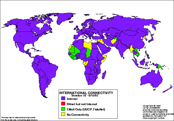
Statistical Maps

Statistical maps are used to display the distribution of some variable over a specified geographic area, usually defined by political boundaries. An example of a statistical map would be such as the one below, illustrating the distribution of the Internet, or the "connectivity of countries", across the globe.


The basis for statistical mapping is that any kind of data that can be expressed numerically/graphically and varies in quantity from place to place can be mapped.
http://personalpages.manchester.ac.uk/staff/m.dodge/cybergeography/atlas/landweber_version_16.gif

Friday, September 12, 2008

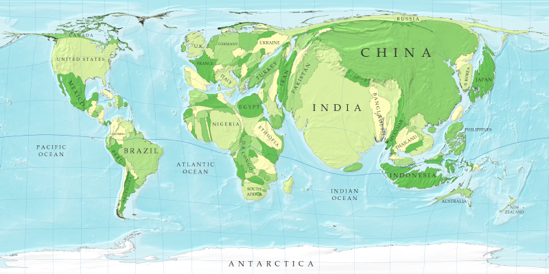
Cartograms


A Cartogram varies the size of geographic areas based on the data values associated with each area. Cartograms scale geographic areas to things such as population, GNP, electoral votes, etc...
The above map is a population cartogram of the world. As you can see, Asia is substantially "bloated" in comparision to the rest of the world's population.

Flow Maps

Flow maps have been used for centuries to show the movement of objects or people from one location to another. They illustrate the flow of people in and out of countries (migration), import and export of goods and raw materials, as well as the flow of wealth across nations.

One example of the use of flow maps would be the illustration of the slave trade, and the movement of slaves from Europe to Africa to the Americas and Carribean, as shown below:

http://exploringafrica.matrix.msu.edu/images/slave_routes.jpg

Isoline map

Isoline maps are maps that use continuous lines to join points of the same value, i.e. equal altitudes (contour lines); equal temperatures (isotherms), etc...

The above Isoline map uses isothermic lines to divide up the continent of Australia into areas of equal tempatures during a typical month of January. So the two areas encompassed by cirlces/lines indicating 95 degrees means that entire area averages 95 degrees during the month of January.
http://mapmaker.rutgers.edu/355/interpolating-70-deg-contou.gif

Proportional Circle Map


Proportional circles map are statistical maps that use a series of circles in increasing/decreasing size to illustrate proportional quantititative measurements. The size of the circle associated with each area of the map is proportional to the variable being described on the map. For instance, the above map is a map of Europe with circles of variable sizes assoicated with each country. These circle proportionately represent the amount of internest users within each country. As you can see, Denmark (one of the smaller nations in Europe) has roughly the same amount of internet users as Norway or Sweden (countries several times bigger than Denmark).
http://www.geog.ucsb.edu/~jeff/gis/proportional_symbols_files/map2.jpg

Choropleth Map

Choropleth maps portray quantitative data as colors showing the density, percent, average value, or quantity of a phenomenon within the boundary of a certain geographic area. Sequential colors (color gradients) indicate increasing positive/negative data values.


A Choropleth map is a type of thematic map in which areas are shaded in proportion to the measurement of the variable being displayed on the map. Some examples include population density or political affiliation. It provides an easy way to visualize how a measurement varies across a geographic area. It also shows the level of variable within a region.
The above choropleth map shows areas of increasing harvest amounts if hay. The darker colors indicate areas of larger hay harvesting.
http://www.nass.usda.gov/research/atlas02/Crops/Hay%20and%20Forage%20Crops%20Harvested/Hay%20-%20All%20Hay%20Including%20Alfalfa,%20Other%20Tame,%20Small%20Grain,%20and%20Wild,%20Harvested%20Acres-choropleth%20map.gif

Thursday, September 11, 2008

Dot Distribution map

Dot Distribution maps portray quantitative data as a dot, which represents a number of any particular phenomenon in question found within the boundary of a certain geographic area. The pattern of distributed dots reflects the general locations where the phenomenon most likely occurs. The pattern and number of dots within a geographic area reveal the density of the phenomenon in question. There are 2 types of dot-distribution maps: the first type is a traditional dot map showing the distribution of a phenomenon; and the second type is an increase/decrease dot map. This ype of dot-distribution map shows increasing (positive) and decreasing (negative) values of a phenomenon.
Dot distribution maps are especially helpful in showing population, portraying quantitative populations as dots. Say I wanted to illustrate population of the United States, with each dot representing a defined number of people. Below is a representation of what this would look like:

The white areas are the most populated areas of this nation, according to the 2000 census. each white dot represents a specific number of people, so those areas where the white dots are more concentrated are more densely populated.

Propaganda map

Propaganda maps are political maps of collapse and possibilities. In other words, they illustrate the possible or desired outcomes of wars and conflicts. For example, the propaganda map below illustrates what Europe would have possibly have looked like, had Germany won WWII:


However, not all propaganda maps center around wars. Propaganda maps can be any map geared at influencing the behaviors and opinions of large numbers of people in order to acheive a desired outcome. Their main purpose is to influence or suade their audience in a certain direction. The map above was probably used to help suade other Germans into the war effort, depicting a future of great power and wealth for all Germans alike.
When thinking of propaganda maps, the game of "Risk" pops into my mind, of conquering the lands of your opponent and expanding your empire across the board.
http://strangemaps.files.wordpress.com/2006/09/sur-le-vif-germany-wins-001.jpg

Hypsometric map


Hypsometric maps represent the differing elevations of the earth's terrain through the use of shading and colors. Hypsometric colors are most common in small scale topographic maps and are applied as continuous gradients or intervals. Most often the shading gradient will begin with lighter/brighter colors depicting the lower levels of elevation, and as the elevation increases the shading becomes darker and darker. This is illustrated on the hysometric map of the Greek island of Boiotia. On the left hand portion of the map you can see the dark areas of shading which represents the highest points of elevation on the island, most likely a mountain.
http://www.uam.es/proyectosinv/sterea/beocia/images/figure_8_gis.jpg

Tuesday, September 9, 2008

PLSS Map


The PLSS is a way of subdividing and describing land in the US. It is used to divide public domain lands (lands owned by the federal gov't). This area encompasses major portions of 30 southern and western states (excluding the original 13 colonies as well as Texas). PLSS maps divide these lands into 6 mile square townships, which are each further divided into 1 mile square sections, which are then divided into quarters, then divided into quarter-quarters and so on. the above map illustrates this concept. Each block within the bold red lines indicates a separate "township" and the smaller sections within each townships are the 1 mile square sections.

The PLSS is a rectangular survey sytem that consists of a series of separate surveys. Most PLSS surveys begin at an initial point, and townships are surveyed north, south, east, and west from that point. The north-south line that runs through the initial point of each township is a true meridian and is called the Principal Meridian. There are 37 Principal Meridians, each is named, and these names are used to distinguish the various surveys. The east-west line that runs through the initial point of the township is called a base line. This line is perpendicular to the Principal Meridian.

Each township is identified with a township(North-South) and range (East-West) designation which indicate the location north south east or west of the Principal Meridian. For example, a township might be identified as Township 7 North, Range 2 West, which would mean that it was in the 7th townships north of a baseline, and 2nd township west of a principal meridian.
Below is a PLSS map illustrating the principle meridians and baselines for the southern states of the PLSS system.

http://www.rootsweb.ancestry.com/~alfrankl/missalalou.jpeg

Cadastral Map


Cadastral maps are maps that show the boundaries and ownership of land parcels. Some show additional information such as survey district names, identifying numbers of parcels, section or lot numbers, etc...
In the US the Cadastral Survey is used by the Bureau of Land Management in maintaining records of all public lands.
The above example of a cadastral map illustrates a small portion of a subdivision (one particular cul-de-sac). In the picture you can see how the land is divided up into individual homeowner's lots. (Clicking on the picture will enlarge it for viewing purposes.)